My projects at

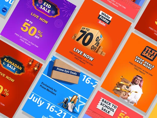
Key Marketing Campaigns for Amazon MENA
My Major contribution in top marketing campaigns at Amazon
White Friday Sale, 11.11 Sale, Prime Day Sale, Ramadan Sale and Back to School Sale are annual peak events for Amazon in UAE, KSA & Egypt, crucial due to their scale and customer expectations. Following were my responsibilities during events.
Planning of production
- Evaluate capacity of available resources.
- Prepare timeline of production.
- Prepare SLA for inputs which are provided by merchandiser teams and SLA for designers and agency to deliver targeted graphics within due dates.
Project coordination
- Sharing inputs sheets with teams of merchandiser and other stakeholder.
- Follow ups on actions required as per playbook.
- Taking regular catch-up to ensuring on time delivery of graphical assets.
Preparing production tracker & Dashboard
- Prepare tracker which is consist of all design requests at one place.
- Building a dashboard that reflects run time production status done by designers and agency.
Identifying & solving adhere problems
- Keeping consistent check on production and coordinating with designer and agency to highlight challenges in order to overcome any upcoming risk.
- Highlighting challenging to leadership and aligning on actions.
Preparing in mockups and style guide
- Creating design templates which used for production by designers and agency.
- Contributing in style guide preparation such as guidance for imagery, typography and final look and feel of visuals.
Creating automation for mass production
Developing automation process which creates bulk of PSD files within seconds, which basic information such as text, discount call outs and product images. this automation tool minimize manual effort of designers up to 80% in designing banners.
Reporting and event Post-mortem
- Event report details designer productivity (output vs. time) and categorizes requests (high/low touch) with asset complexity (graphical).
- Post-mortem captures campaign highlights, lowlights and their impact.


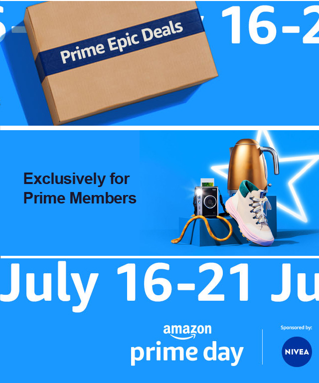


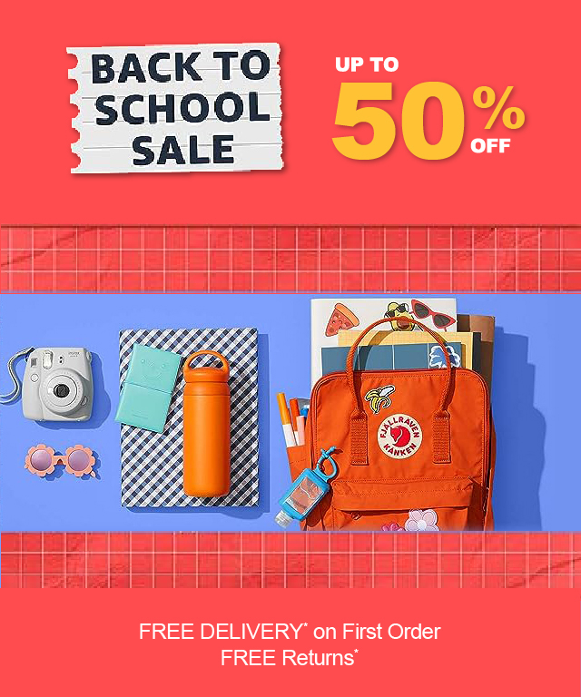
Leading Key Marketing Campaigns
My role: Planning, Coordination, Developing Dashboard, Innovating, Problem solving, Style guide, Templates, Design automation & Reporting.
Key Marketing Campaigns for Amazon MENA
My Major contribution in top marketing campaigns at Amazon
White Friday Sale, 11.11 Sale, Prime Day Sale, Ramadan Sale and Back to School Sale are annual peak events for Amazon in UAE, KSA & Egypt, crucial due to their scale and customer expectations. Following were my responsibilities during events.
Planning of production
- Evaluate capacity of available resources.
- Prepare timeline of production.
- Prepare SLA for inputs which are provided by merchandiser teams and SLA for designers and agency to deliver targeted graphics within due dates.
Project coordination
- Sharing inputs sheets with teams of merchandiser and other stakeholder.
- Follow ups on actions required as per playbook.
- Taking regular catch-up to ensuring on time delivery of graphical assets.
Preparing production tracker & Dashboard
- Prepare tracker which is consist of all design requests at one place.
- Building a dashboard that reflects run time production status done by designers and agency.
Identifying & solving adhere problems
- Keeping consistent check on production and coordinating with designer and agency to highlight challenges in order to overcome any upcoming risk.
- Highlighting challenging to leadership and aligning on actions.
Preparing in mockups and style guide
- Creating design templates which used for production by designers and agency.
- Contributing in style guide preparation such as guidance for imagery, typography and final look and feel of visuals.
Creating automation for mass production
Developing automation process which creates bulk of PSD files within seconds, which basic information such as text, discount call outs and product images. this automation tool minimize manual effort of designers up to 80% in designing banners.
Reporting and event Post-mortem
- Event report details designer productivity (output vs. time) and categorizes requests (high/low touch) with asset complexity (graphical).
- Post-mortem captures campaign highlights, lowlights and their impact.


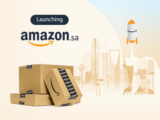
Amazon Launch in Saudi
Project: Amazon Launch in Saudi
Company : Amazon
Scale of project: Large
My Role: Understanding Problem, Providing Design Solution and creating design theme
Templatization, Monitoring agency for production.
Project Intro and Problem Statement
Global brand acquired souq.com which was leading e-commerce leader in the region. It was critical as to communicate the acquisition to Souq culture in right way without breaking the trust and loyalty of customers. This change ease to bring more value to customer in sense of selection, customer services and fast delivery to make delight the customers.
Solution
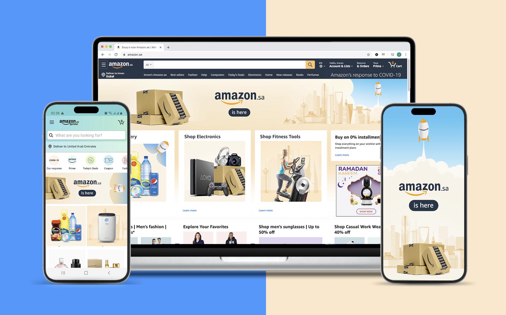
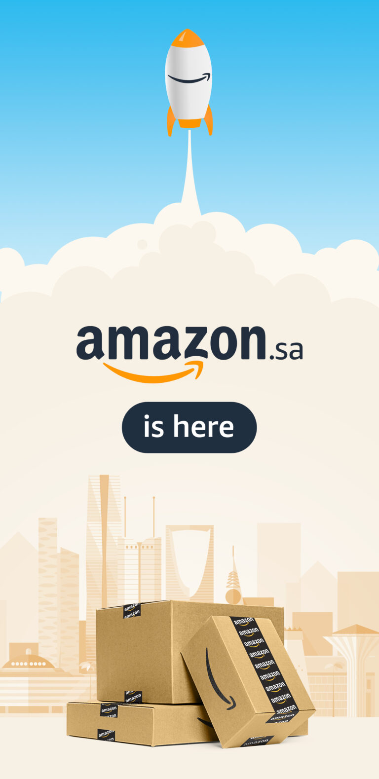
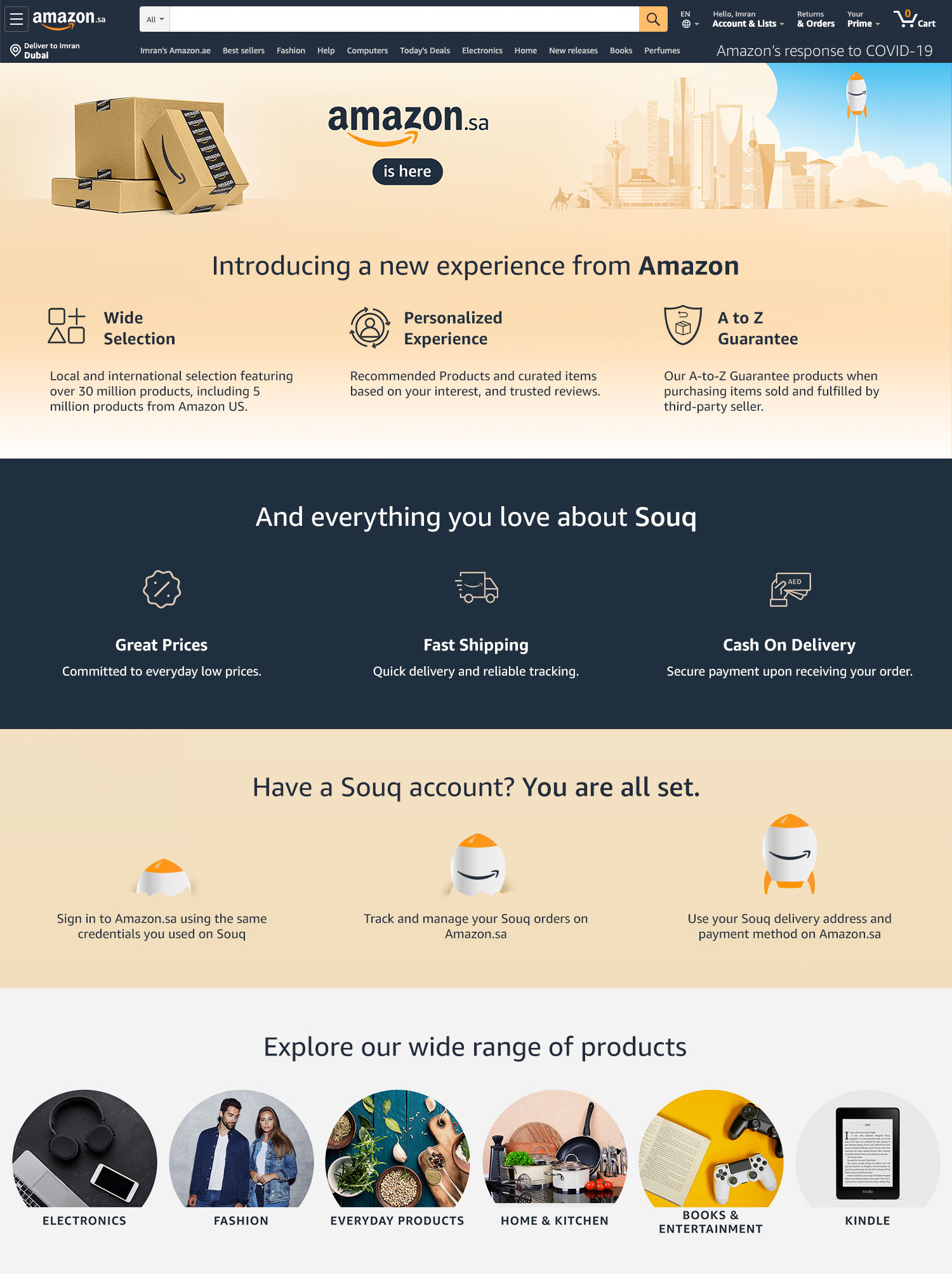
Though Amazon is a US company we wanted to pronounced as an intention as Souq which is a local company to do this the concept was to relate to MENA region by using desert color theme and use the skyline of KSA.
My contribution
Getting brief from team, brainstorming with stakeholders, research, propose design solution through mood-board, and creating templates for agency to work on production.
Project Scope
Campaign cope was throughout all channels which includes on side digital placements, Outbounds such as newsletters and digital campaign ads and social media posts.
Impact
Well received and served the purpose where SOUQ customer converted to required scale.
Design theme and execution was appreciated by leadership and marketing director. The visuals were simple but yet effective.
The design clearly showed that Amazon is coming to the region. It explained the advantages of using Amazon and its high standards, all while respecting the local values of KSA, just like SOUQ did.
Design adoption and execution
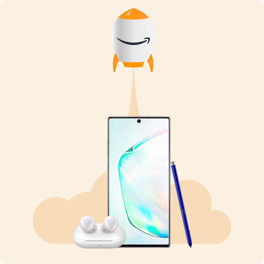
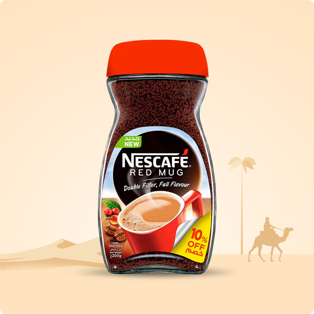
Cohesive visuals across the campaign (icons, sections) mirrored the hero image’s style, reinforcing the message. Key colors, elements (e.g., Saudi skyline), and prominent Amazon branding ensured a consistent user experience in all materials (landing page, newsletters, banners).
Launching Amazon in Region
My role: Coordinating & Research, Creating design concept Creating templates, Monitoring design team for production .
Amazon Launch in Saudi
Project: Amazon Launch in Saudi
Company : Amazon
Scale of project: Large
My Role: Understanding Problem, Providing Design Solution and creating design theme
Templatization, Monitoring agency for production.
Project Intro and Problem Statement
Global brand acquired souq.com which was leading e-commerce leader in the region. It was critical as to communicate the acquisition to Souq culture in right way without breaking the trust and loyalty of customers. This change ease to bring more value to customer in sense of selection, customer services and fast delivery to make delight the customers.
Solution
Though Amazon is a US company we wanted to pronounced as an intention as Souq which is a local company to do this the concept was to relate to MENA region by using desert color theme and use the skyline of KSA.
My contribution
Getting brief from team, brainstorming with stakeholders, research, propose design solution through mood-board, and creating templates for agency to work on production.
Project Scope
Campaign cope was throughout all channels which includes on side digital placements, Outbounds such as newsletters and digital campaign ads and social media posts.
Impact
Well received and served the purpose where SOUQ customer converted to required scale.
Design theme and execution was appreciated by leadership and marketing director. The visuals were simple but yet effective.
The design clearly showed that Amazon is coming to the region. It explained the advantages of using Amazon and its high standards, all while respecting the local values of KSA, just like SOUQ did.


Design adoption and execution
Cohesive visuals across the campaign (icons, sections) mirrored the hero image’s style, reinforcing the message. Key colors, elements (e.g., Saudi skyline), and prominent Amazon branding ensured a consistent user experience in all materials (landing page, newsletters, banners).


OHL - Category Marketing Campaign for AE & SA
Project: Home Makeover Sale
Company : Amazon
Scale of project: Large
My Role: Understanding Problem, Providing Design Solution and creating design theme
Templatization, Monitoring agency for production.
Project Overview & Problem Statement
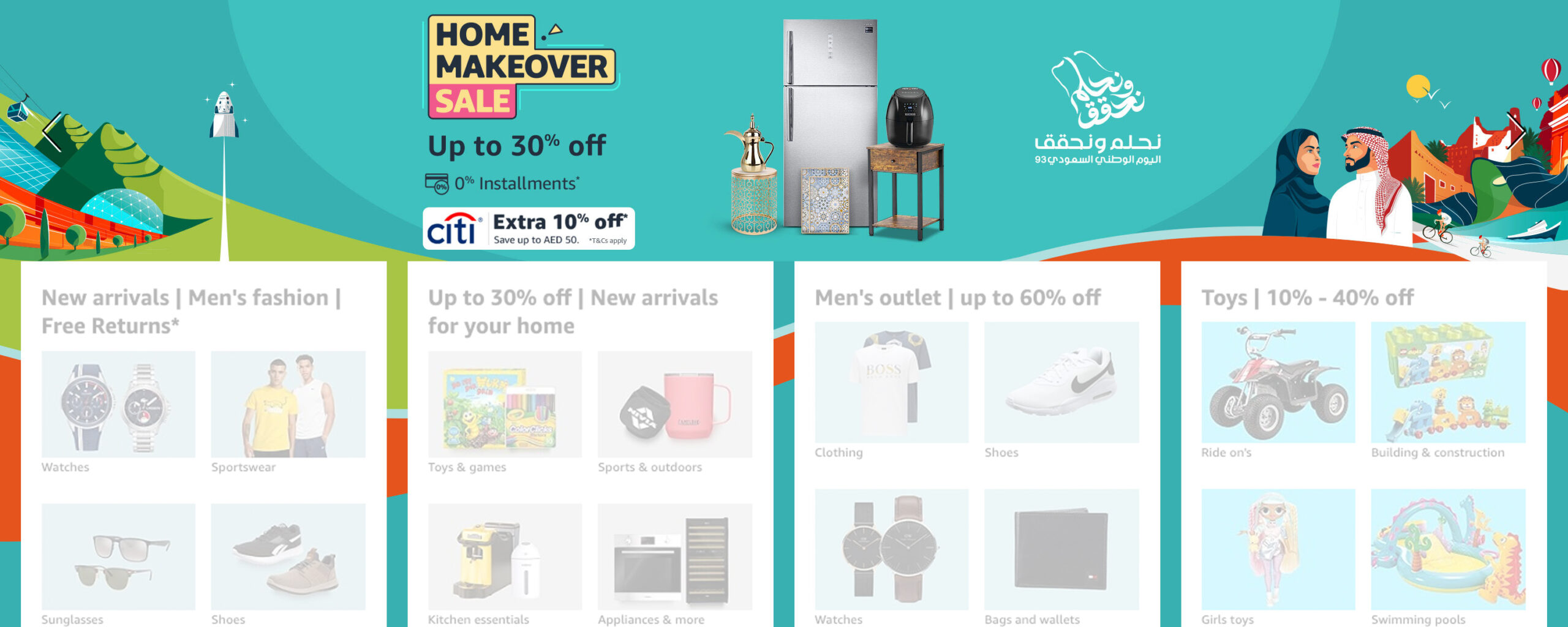
Home Makeover Sale is key monthly recurring event for OHL which is one of key Amazon category runs for AE and SA locals. As business was growing the event was the engagement due to its own brand identity, the requirement was to come up with event identity and style guide to make sure that design has localization element its look and feel in visuals.
Process
⤷ Aligning with stakeholders on inputs
⤷ Reviewing existing designs
⤷ Brainstorming & Research
⤷ Creating event identity (logo) + Creating mood board
⤷ Creating templates
⤷ Direction to agency for execution.
Solution
I took an initiative to revamp them and evaluated all area creative placements to improve theme through new style guide, the style guide idea consists of add all home relevant elements which also must look local and traditional as well as modern lifestyle elements, make event like sale by focusing discount call outs, develop colour combination which is appeal the eyes and also make design theme flexible to integrate with other campaigns as well as cross categories.
Project Scope
Campaign cope was throughout all channels which includes on side digital placements, Outbounds such as newsletters and digital campaign ads and social media posts.
Impact
Work was appreciated by AE & SA leaders due to inject localization part in design.
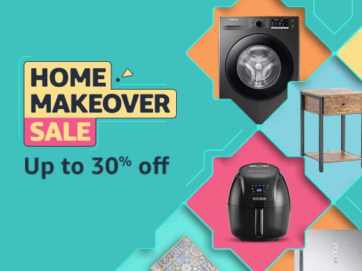
The fresh logo design built a dedicated identification to event which grab attention of viewers and increased CTR up to 17% within first three months.
Flexible design template approach helped in having multiple layouts with lifestyle model and products to gather..
Key Visual
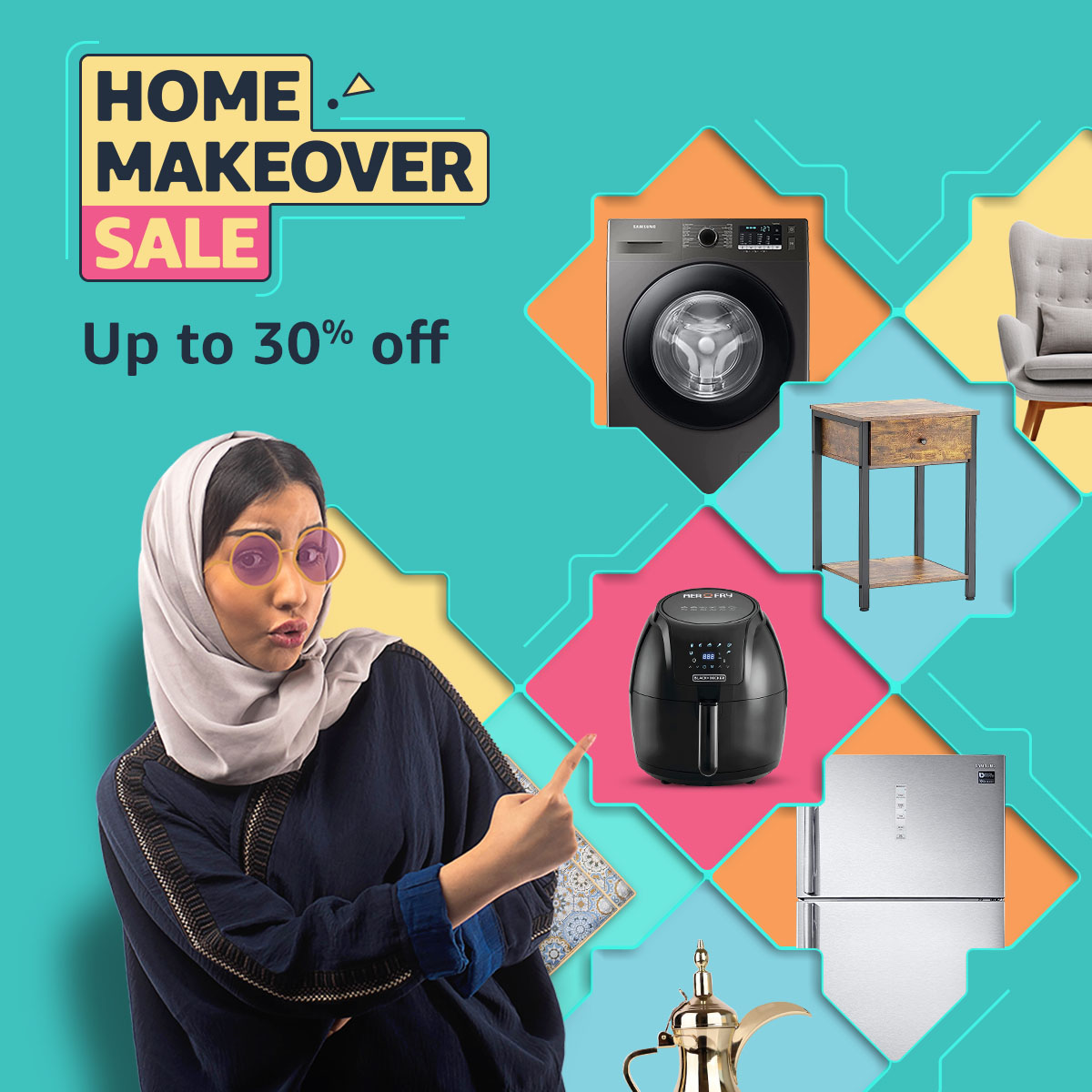
Consist of Campaign Logo, Localized Design elements, Human connection, Sale feel, vibrant colors.
Execution and adoption for other channels
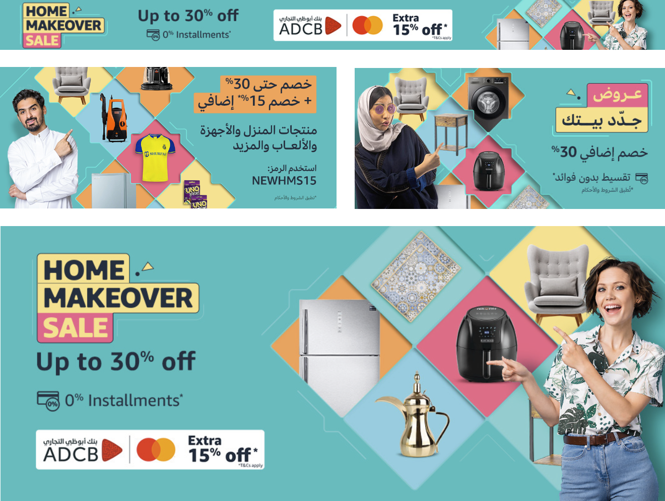
While creating design I kept in mind that it has to be flexible to adapt seamlessly to landing pages, newsletters, and social media, and all other channels.
Integration with other campaigns
The campaign identity and theme is flexible enough to integrate with other campaigns or categories as well. the one of integral execution successful done was with Saudi Foundation Day.
Revamping Design Concept
My role: Coordination, Concept, Developing Dashboard, Problem solving, Developing Style Guide, Templates, Managing agency for production & Reporting.
OHL - Category Marketing Campaign for AE & SA
My Major contribution in top marketing campaigns at Amazon
White Friday Sale, 11.11 Sale, Prime Day Sale, Ramadan Sale and Back to School Sale are annual peak events for Amazon in UAE, KSA & Egypt, crucial due to their scale and customer expectations. Following were my responsibilities during events.
Planning of production
- Evaluate capacity of available resources.
- Prepare timeline of production.
- Prepare SLA for inputs which are provided by merchandiser teams and SLA for designers and agency to deliver targeted graphics within due dates.
Project coordination
- Sharing inputs sheets with teams of merchandiser and other stakeholder.
- Follow ups on actions required as per playbook.
- Taking regular catch-up to ensuring on time delivery of graphical assets.
Preparing production tracker & Dashboard
- Prepare tracker which is consist of all design requests at one place.
- Building a dashboard that reflects run time production status done by designers and agency.
Identifying & solving adhere problems
- Keeping consistent check on production and coordinating with designer and agency to highlight challenges in order to overcome any upcoming risk.
- Highlighting challenging to leadership and aligning on actions.
Preparing in mockups and style guide
- Creating design templates which used for production by designers and agency.
- Contributing in style guide preparation such as guidance for imagery, typography and final look and feel of visuals.
Creating automation for mass production
Developing automation process which creates bulk of PSD files within seconds, which basic information such as text, discount call outs and product images. this automation tool minimize manual effort of designers up to 80% in designing banners.
Reporting and event Post-mortem
- Event report details designer productivity (output vs. time) and categorizes requests (high/low touch) with asset complexity (graphical).
- Post-mortem captures campaign highlights, lowlights and their impact.


New Launch Category Campaign for UAE
Project: Amazon Home Services Style Guide
Company : Amazon
Scale of project: Large
My Role: Understanding Problem, Providing Solution,
Building Style guide, Templatization, Monitoring agency for production..
Project Overview & Problem Statement
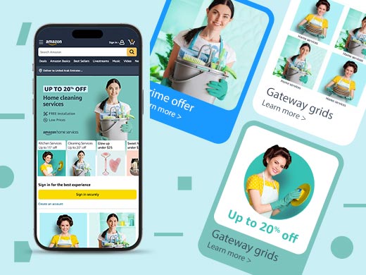
AHS, a new service category on Amazon.ae offering automotive, furniture, electronics repair and more, faced inconsistency across channels due to lack of a style guide. They sought a seamless user experience with Prime and other categories, alongside a UI refresh to improve view rates.
Process
⤷ Aligning with stakeholders on inputs
⤷ Reviewing existing designs
⤷ Brainstorming & Research
⤷ Creating mood board
⤷ Creating templates
⤷ Direction to agency for execution.
Solution
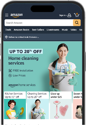
I come up with design theme which resonate with services provided by AHS category. I created a style guide with guidance on typography, design elements, and templates suites on-site as well as Out-bound executions. This style guide is very flexible to easily accommodate other categories or events themes.
My contribution
Getting brief from AHS team, brainstorming with stakeholders, research, propose design solution through mood-board, and creating templates for agency to work on production.
Impact
A new style guide boosted key placement engagement on the homepage, prompting increased placements, driving traffic to store pages, and ultimately resulting in a better customer experience (CX).
Theme & layout improvements over 4 months significantly increased user engagement on the store page.
Color theme, Design elements & Key visual
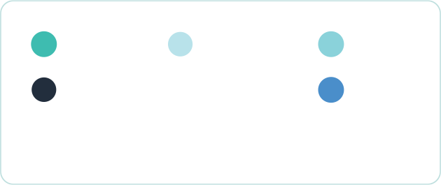

Design elements: Leveraging insights from placements, size constraints, content adaptability, and best UX practices, this style guide outlines four fundamental shapes that will be consistently employed throughout executions, ensuring optimal user experience.
Process
⤷ Aligning with stakeholders on brief
⤷ Brainstorming & Research
⤷ Creating mood board
⤷ Creating templates
⤷ Direction to agency for execution.
Adoption of Style guide for other channels
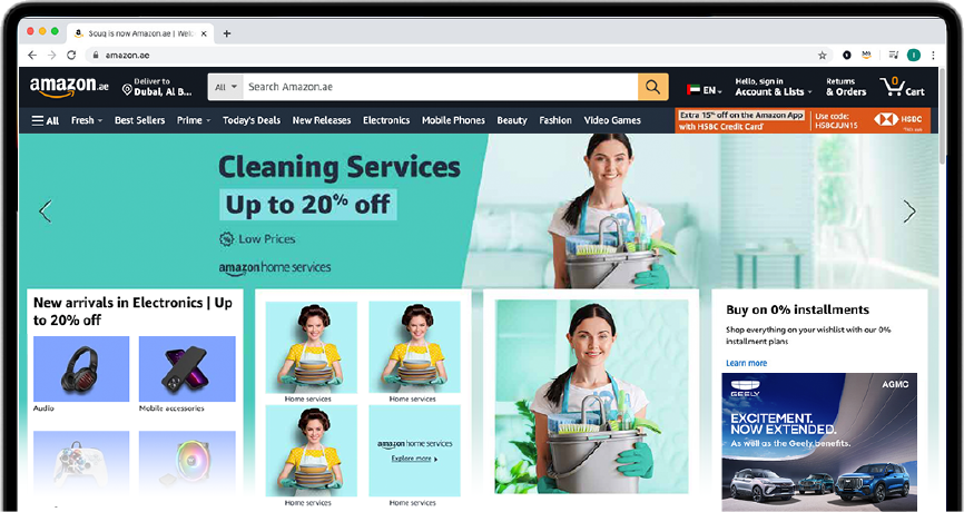
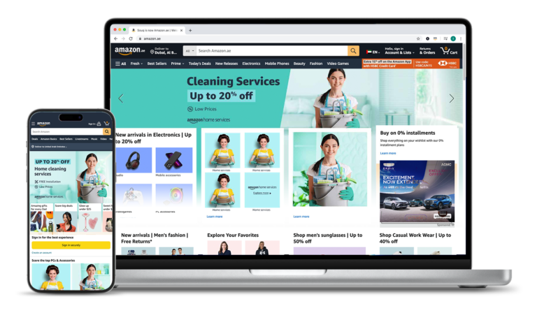
Encompassing AHS’s diverse placements, this flexible style guide adapts seamlessly to landing pages, newsletters, and social media, ensuring consistent brand identity across formats (square, vertical, horizontal) as showcased.


Creating Design Concept
My role: Production Planning, Coordination, Developing Dashboard, Innovating, Problem solving, Style guide, Templates, Automation & Reporting.
New Launch Category Campaign for UAE
Project: Amazon Home Services Style Guide
Company : Amazon
Scale of project: Large
My Role: Understanding Problem, Providing Solution,
Building Style guide, Templatization, Monitoring agency for production..
Project Overview & Problem Statement
AHS, a new service category on Amazon.ae offering automotive, furniture, electronics repair and more, faced inconsistency across channels due to lack of a style guide. They sought a seamless user experience with Prime and other categories, alongside a UI refresh to improve view rates.
Process
⤷ Aligning with stakeholders on inputs
⤷ Reviewing existing designs
⤷ Brainstorming & Research
⤷ Creating mood board
⤷ Creating templates
⤷ Direction to agency for execution.
Solution
I come up with design theme which resonate with services provided by AHS category. I created a style guide with guidance on typography, design elements, and templates suites on-site as well as Out-bound executions. This style guide is very flexible to easily accommodate other categories or events themes.
My contribution
Getting brief from AHS team, brainstorming with stakeholders, research, propose design solution through mood-board, and creating templates for agency to work on production.
Impact
A new style guide boosted key placement engagement on the homepage, prompting increased placements, driving traffic to store pages, and ultimately resulting in a better customer experience (CX).
Theme & layout improvements over 4 months significantly increased user engagement on the store page.
Color theme, Design elements & Key visual


Design elements: Leveraging insights from placements, size constraints, content adaptability, and best UX practices, this style guide outlines four fundamental shapes that will be consistently employed throughout executions, ensuring optimal user experience.


Process
⤷ Aligning with stakeholders on brief
⤷ Brainstorming & Research
⤷ Creating mood board
⤷ Creating templates
⤷ Direction to agency for execution.
Adoption of Style guide for other channels
Encompassing AHS’s diverse placements, this flexible style guide adapts seamlessly to landing pages, newsletters, and social media, ensuring consistent brand identity across formats (square, vertical, horizontal) as showcased.


Design Revamp of Recurring Marketing Campaign - AE
Project: Month End Saver Design Theme
Company : Amazon
Scale of project: Medium
My Role: Understanding brief, Providing Design Solution and creating design theme
Created Templates, Execution.
Context
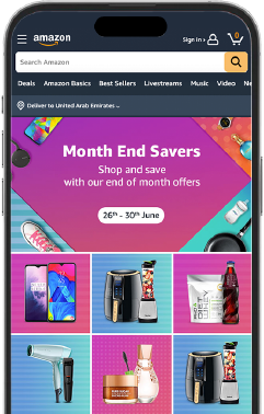
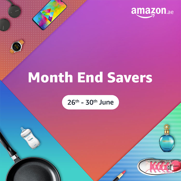
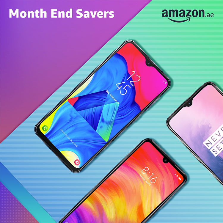
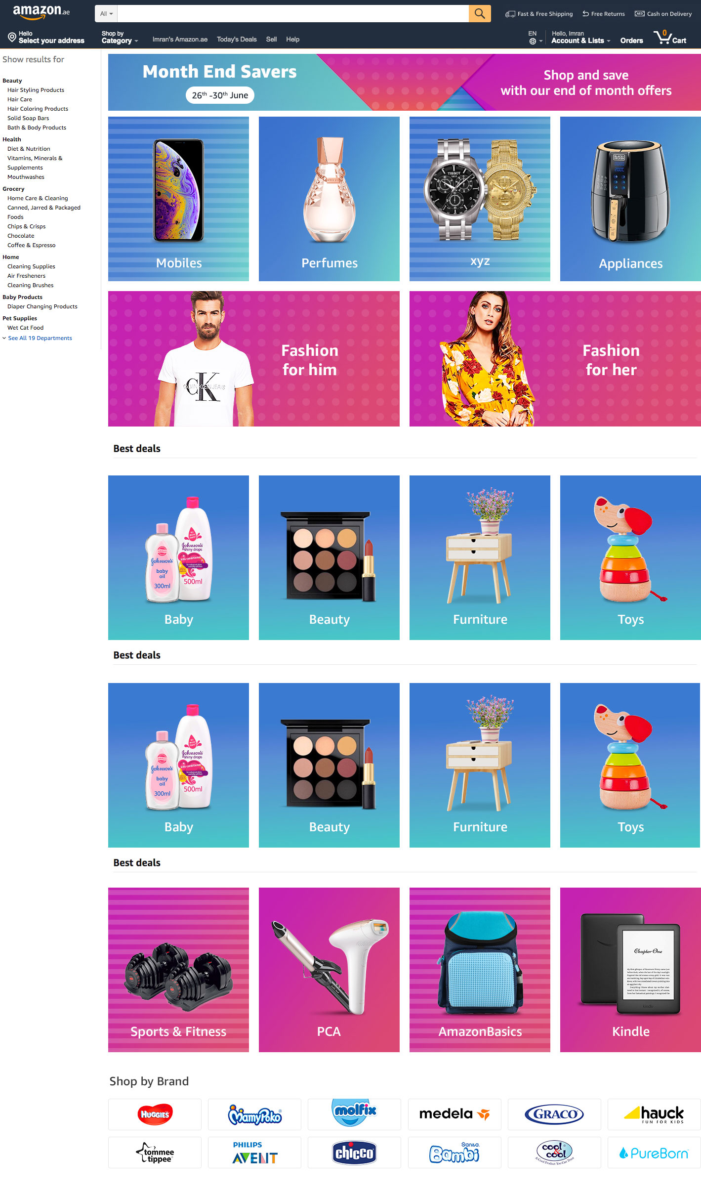
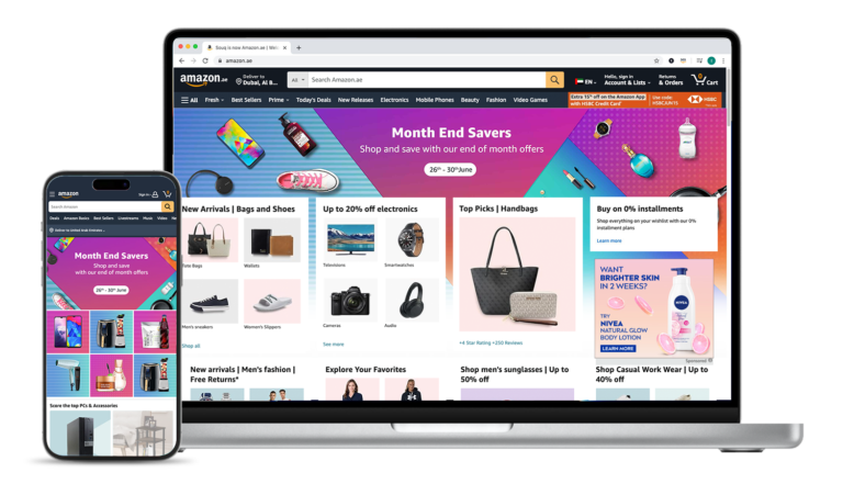
The Month End Saver campaign gets a refresh with dedicated themes each quarter, aiming for longer customer engagement through a vibrant and flexible design.
Design Solution
My design solution prioritizes a visually engaging and flexible aesthetic, effortlessly adapting to a wide range of products. The modern and sophisticated look caters to a discerning audience for a seamless user experience.

Design adaptability for all channels
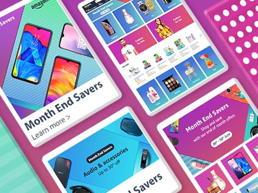
The design exhibited exceptional flexibility, seamlessly accommodating a wide range of colors, product sizes, and presentation angles. This versatility ensured its successful application across various campaign channels, including Amazon Gateway, social media platforms, landing pages, and email newsletters. Selected design examples are available for your review.


Revamping Event Design
My role: Planning, Coordination, Developing Dashboard, Innovating, Problem solving, Style guide, Templates, Automation & Reporting.
Design Revamp of Recurring Marketing Campaign - AE
Project: Month End Saver Design Theme
Company : Amazon
Scale of project: Medium
My Role: Understanding brief, Providing Design Solution and creating design theme
Created Templates, Execution.
Context
The Month End Saver campaign gets a refresh with dedicated themes each quarter, aiming for longer customer engagement through a vibrant and flexible design.
Design Solution
My design solution prioritizes a visually engaging and flexible aesthetic, effortlessly adapting to a wide range of products. The modern and sophisticated look caters to a discerning audience for a seamless user experience.


Design adaptability for all channels
The design exhibited exceptional flexibility, seamlessly accommodating a wide range of colors, product sizes, and presentation angles. This versatility ensured its successful application across various campaign channels, including Amazon Gateway, social media platforms, landing pages, and email newsletters. Selected design examples are available for your review.


OHL - Category Marketing Campaign for AE & SA
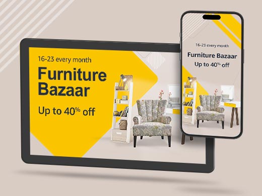
Project: Furniture Bazaar Design Theme
Company : Amazon
Scale of project: Small
My Role: Understanding brief, Providing Design Solution
and creating design theme, Execution.
Context
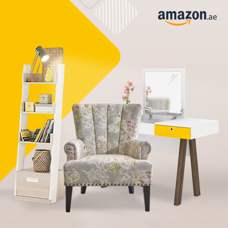
Due to the recurring nature of the Furniture Bazaar campaign, the challenge lies in presenting a fresh and engaging experience for customers at each iteration, while maintaining brand consistency and ensuring immediate campaign recognition.
Solution
To achieve a fresh campaign experience, I implemented sub-themes while maintaining core design principles like clean aesthetics, text formatting, and product layout. By introducing flexibility in elements like the color and angle of a signature blade shape, a significant refresh was achieved, enhancing the customer experience.



Revamping Event Theme
My role: Production Planning, Coordination, Developing Dashboard, Innovating, Problem solving, Style guide, Templates, Automation & Reporting.
OHL - Marketing Campaigns for Amazon UAE & KSA
Project: Furniture Bazaar Design Theme
Company : Amazon
Scale of project: Small
My Role: Understanding brief, Providing Design Solution
and creating design theme, Execution.
Context
Due to the recurring nature of the Furniture Bazaar campaign, the challenge lies in presenting a fresh and engaging experience for customers at each iteration, while maintaining brand consistency and ensuring immediate campaign recognition.
Solution
To achieve a fresh campaign experience, I implemented sub-themes while maintaining core design principles like clean aesthetics, text formatting, and product layout. By introducing flexibility in elements like the color and angle of a signature blade shape, a significant refresh was achieved, enhancing the customer experience.


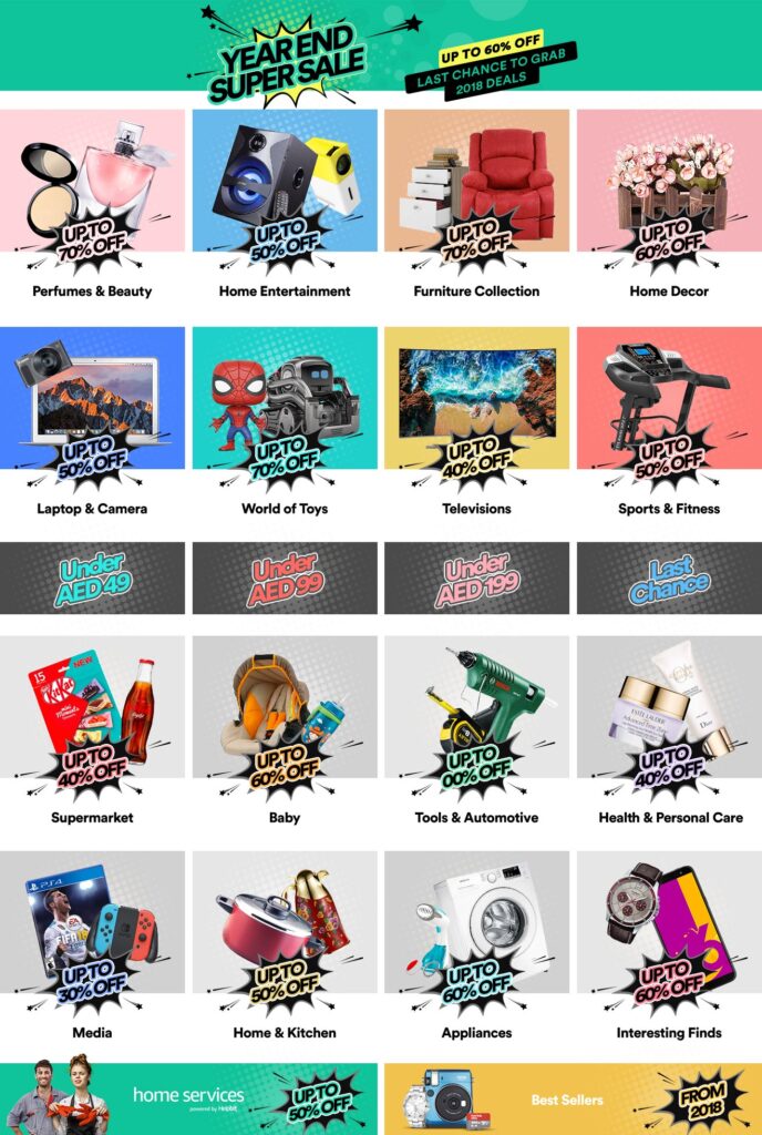
Design Theme - Year end super sale - AE
Project: End of Month Sale Design Theme
Company : Amazon
Scale of project: Medium
My Role: Understanding brief, Providing Design Solution
and creating design theme, Execution.
Context
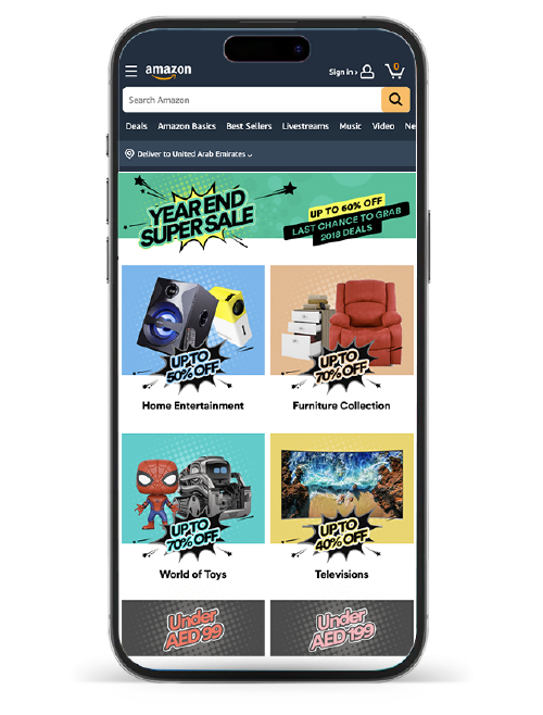
The design aims to excite viewers with surprising sale, featuring adaptable variations to accommodate all different type of participating / categories.
Solution
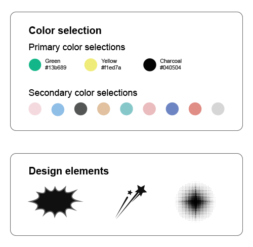
Unleash the Sale identity! i used bold colors and blasting discount to grab attention of viewers. Highlighted key categories & value for a clear, impactful message.
Impact
The campaign achieved a 11.5% increase in click-through rates, category appreciated designs and approved concept in one go.
All the items on the landing page got the same amount of attention, even if they weren’t placed next to the main picture, because of how we used color.
Color Selection & Design Elements
Creating Design Concept
My role: Coordinating & Research, Creating design concept Creating templates, Monitoring design team for production .
Design Theme - Year end super sale - AE
Project: End of Month Sale Design Theme
Company : Amazon
Scale of project: Medium
My Role: Understanding brief, Providing Design Solution
and creating design theme, Execution.
Context
The design aims to excite viewers with surprising sale, featuring adaptable variations to accommodate all different type of participating / categories.
Solution
Unleash the Sale identity! i used bold colors and blasting discount to grab attention of viewers. Highlighted key categories & value for a clear, impactful message.
Impact
The campaign achieved a 11.5% increase in click-through rates, category appreciated designs and approved concept in one go.
All the items on the landing page got the same amount of attention, even if they weren’t placed next to the main picture, because of how we used color.
Color Selection & Design Elements


Fashion - Beauty week marketing campaign
Project: Beauty Week
Company : SOUQ an Amazon Company
Scale of project: Medium
My Role: Understanding Problem, Providing Design Solution and creating design theme and templates and production.
Project Overview & Problem Statement
Beauty Week is key monthly recurring event for Fashion category which is one of key category of SOUQ runs for AE, SA and Egypt locals. The requirement was to come up with campaign identity and appealing design theme with assurance that design is relevant to beauty.
Process
⤷ Understanding brief
⤷ Reviewing existing designs
⤷ Brainstorming with category & Research
⤷ Creating event identity (logo) + Creating mood board
⤷ Creating templates
⤷ Execution for final assets.
Solution
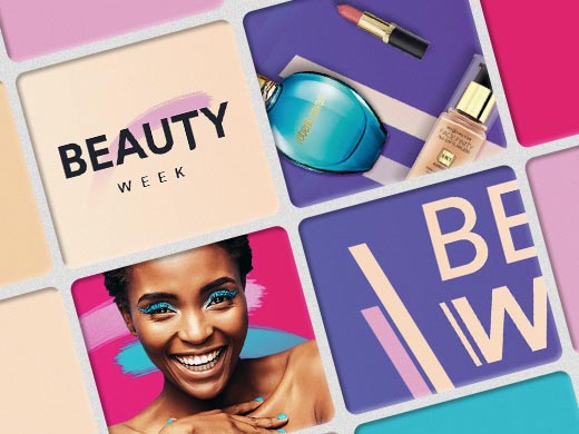
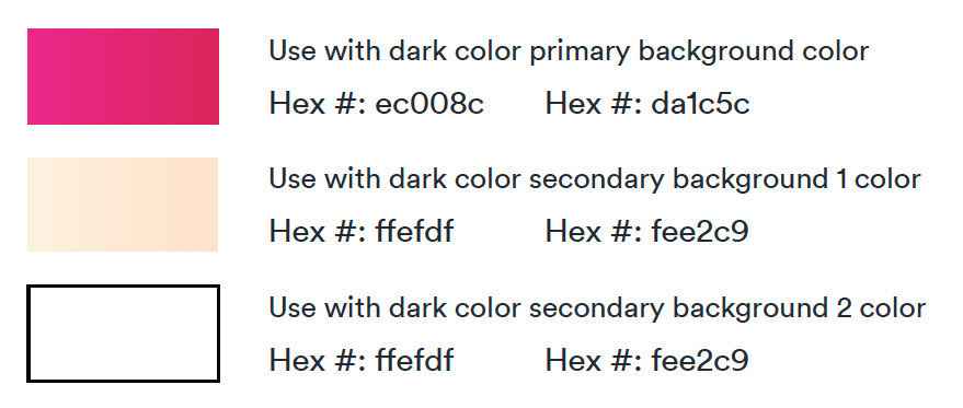
Created color pallet which is more relevant to fashion and beauty.
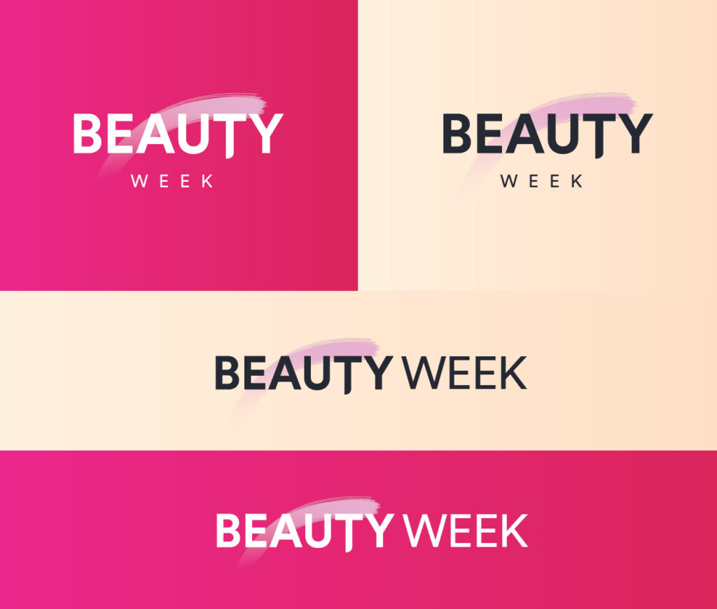
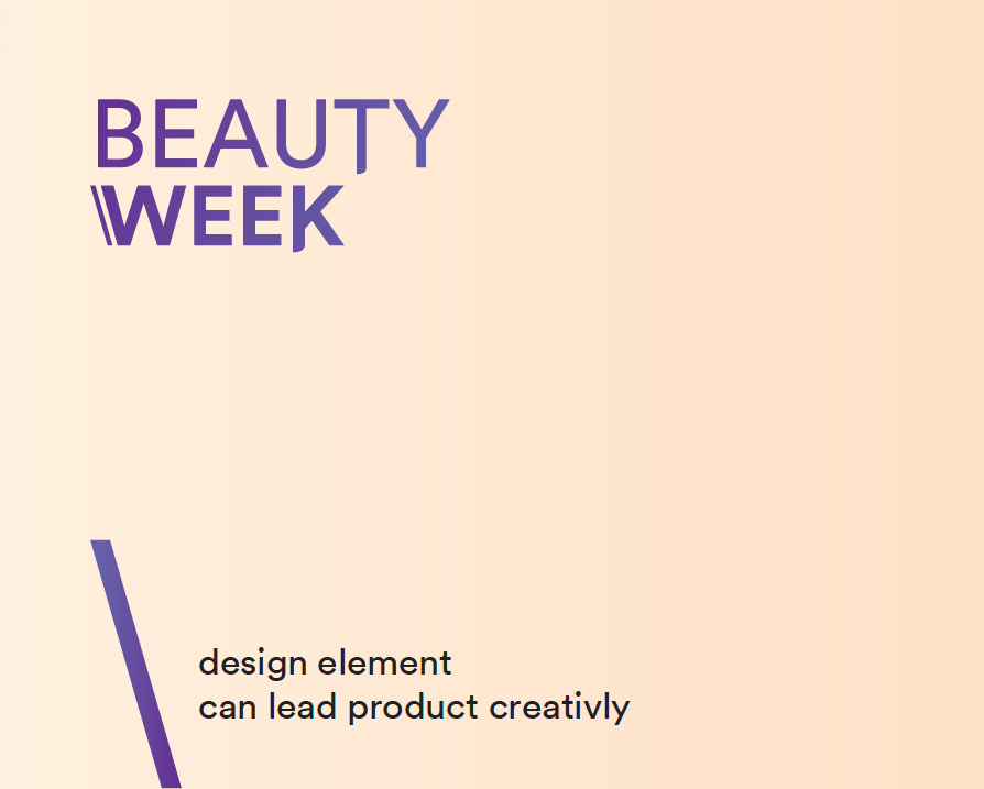
Selected fonts with combination of Bold and Slim so that it distinguish words “Beauty” & “Week” to give clear visual message to audience through identity.
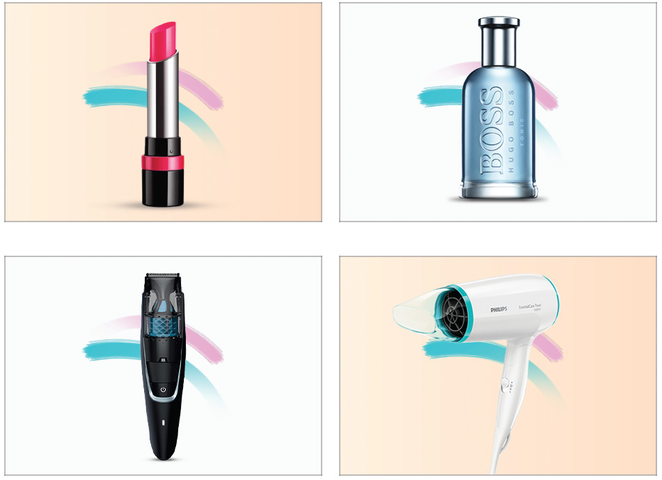
Use lifestyle model with selection of female model having makeup as well as treated as well as selected most common beauty products through out the execution to make design more relevant.
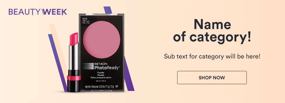
Used very common element of makeup with shape of brush behind identity, model and products which emphasise the each visual to wards beauty touch.
In order to give fresh look two color themes were used with slight difference those were used alternatively per month through out the year. however in each occurrence category is allowed to refresh model image and category products.
Project Scope
Campaign cope was throughout all channels which includes on side digital placements, Outbounds such as newsletters and digital campaign ads and social media posts.
Impact
The design solution effectively leverages visual elements to create a strong and distinctive identity for a Beauty Week campaign. By incorporating a fashion-oriented color palette, contrasting fonts, and lifestyle imagery featuring beauty products, the design successfully communicates the core message of the campaign.
The use of a makeup brush as a recurring element reinforces the beauty focus, while the alternating color themes provide a fresh and dynamic look throughout the year. The ability to refresh model imagery and product selection within each category ensures the campaign remains current and engaging.
Overall, the design solution is expected to enhance brand recognition, increase audience engagement, and effectively convey the essence of Beauty Week.
Campaign identity
Two sets of identity were created which were used alternatively each month.
Campaign identity for month A

Campaign identity for month B

Typography
As per requirement only two type of font fonts weight were selected from “Circular TT” font family.
Headings
Sub Headings
Color Theme
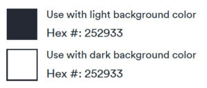
Color set for TEXT
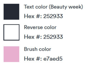
Color set for LOGO
Color set for BACKGROUND
Design Theme for Odd Month's Execution


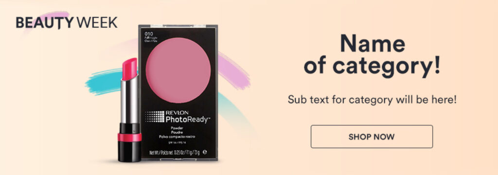
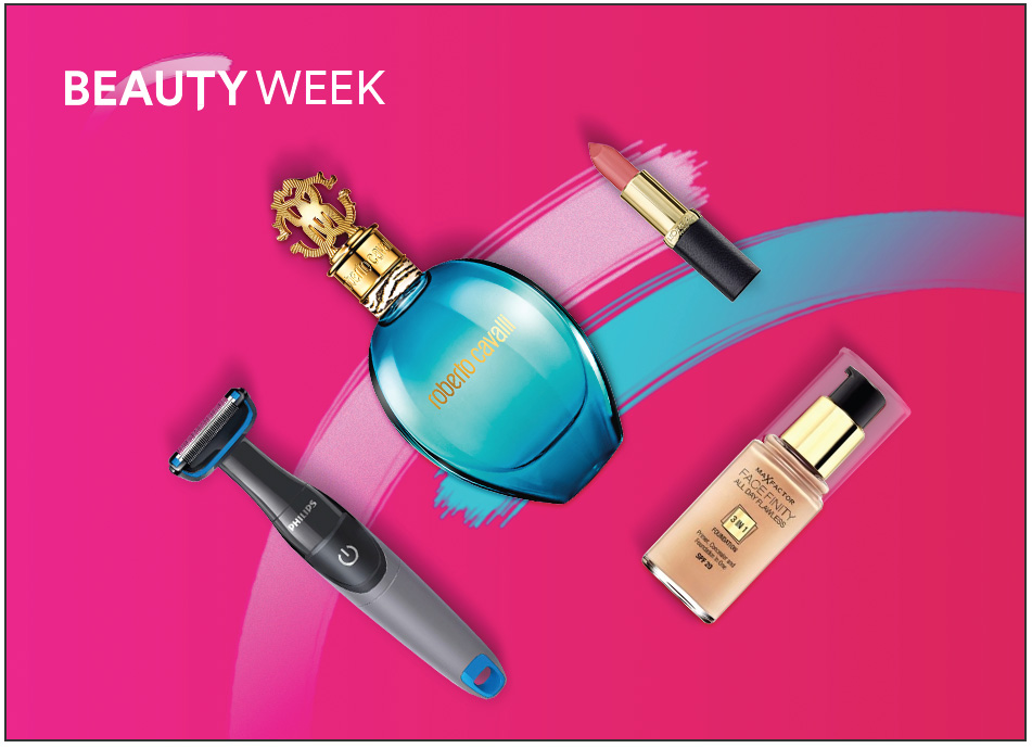
Design Theme for Even Month's Execution


Creating Design Concept
My role: Production Planning, Coordination, Developing Dashboard, Innovating, Problem solving, Style guide, Templates, Automation & Reporting.
Fashion - Beauty week marketing campaign
Project: Beauty Week
Company : SOUQ an Amazon Company
Scale of project: Medium
My Role: Understanding Problem, Providing Design Solution and creating design theme and templates and production.
Project Overview & Problem Statement
Beauty Week is key monthly recurring event for Fashion category which is one of key category of SOUQ runs for AE, SA and Egypt locals. The requirement was to come up with campaign identity and appealing design theme with assurance that design is relevant to beauty.
Process
⤷ Understanding brief
⤷ Reviewing existing designs
⤷ Brainstorming with category & Research
⤷ Creating event identity (logo) + Creating mood board
⤷ Creating templates
⤷ Execution for final assets.
Solution
Created color pallet which is more relevant to fashion and beauty.
Selected fonts with combination of Bold and Slim so that it distinguish words “Beauty” & “Week” to give clear visual message to audience through identity.
Use lifestyle model with selection of female model having makeup as well as treated as well as selected most common beauty products through out the execution to make design more relevant.
Used very common element of makeup with shape of brush behind identity, model and products which emphasise the each visual to wards beauty touch.
In order to give fresh look two color themes were used with slight difference those were used alternatively per month through out the year. however in each occurrence category is allowed to refresh model image and category products.
Project Scope
Campaign cope was throughout all channels which includes on side digital placements, Outbounds such as newsletters and digital campaign ads and social media posts.
Impact
The design solution effectively leverages visual elements to create a strong and distinctive identity for a Beauty Week campaign. By incorporating a fashion-oriented color palette, contrasting fonts, and lifestyle imagery featuring beauty products, the design successfully communicates the core message of the campaign.
The use of a makeup brush as a recurring element reinforces the beauty focus, while the alternating color themes provide a fresh and dynamic look throughout the year. The ability to refresh model imagery and product selection within each category ensures the campaign remains current and engaging.
Overall, the design solution is expected to enhance brand recognition, increase audience engagement, and effectively convey the essence of Beauty Week.
Campaign identity
Two sets of identity were created which were used alternatively each month.
Campaign identity for month A

Campaign identity for month B

Typography
As per requirement only two type of font fonts weight were selected from “Circular TT” font family.
Headings
Sub Headings
Color Theme
Color set for TEXT

Color set for LOGO

Color set for BACKGROUND

Design Theme for Odd Month's Execution


Design Theme for Even Month's Execution


More
Exclusive Projects
UI/UX Project of Financial APP
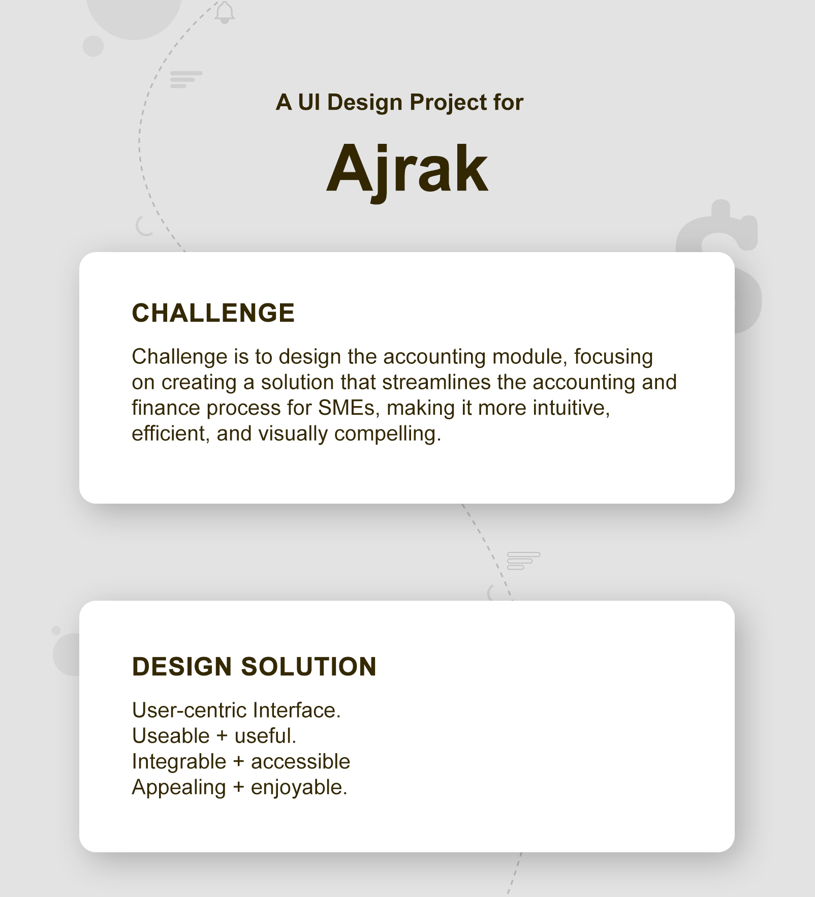
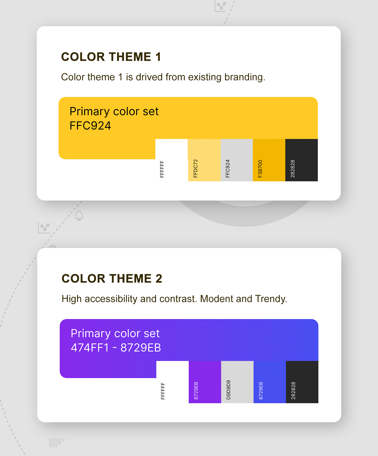
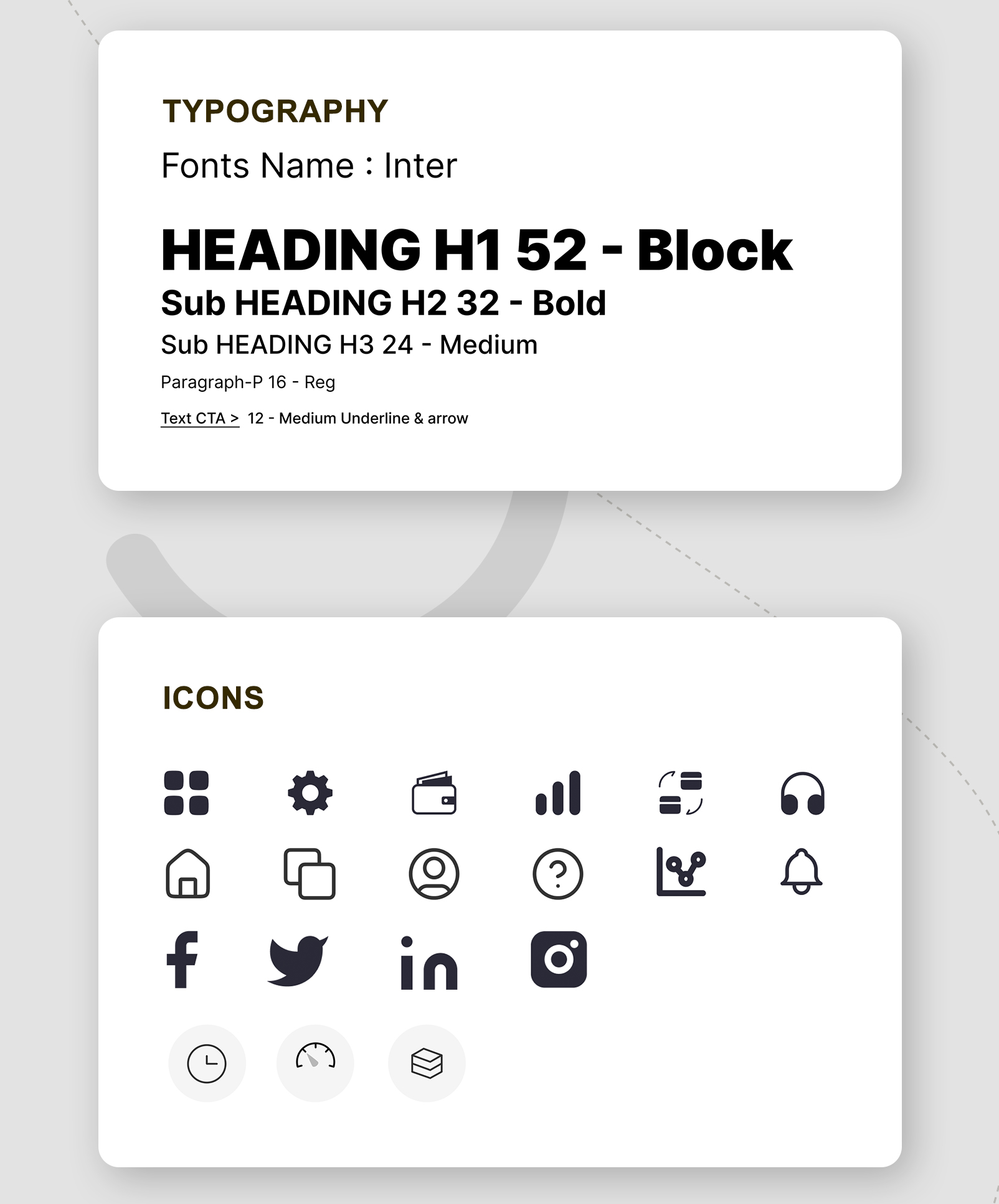
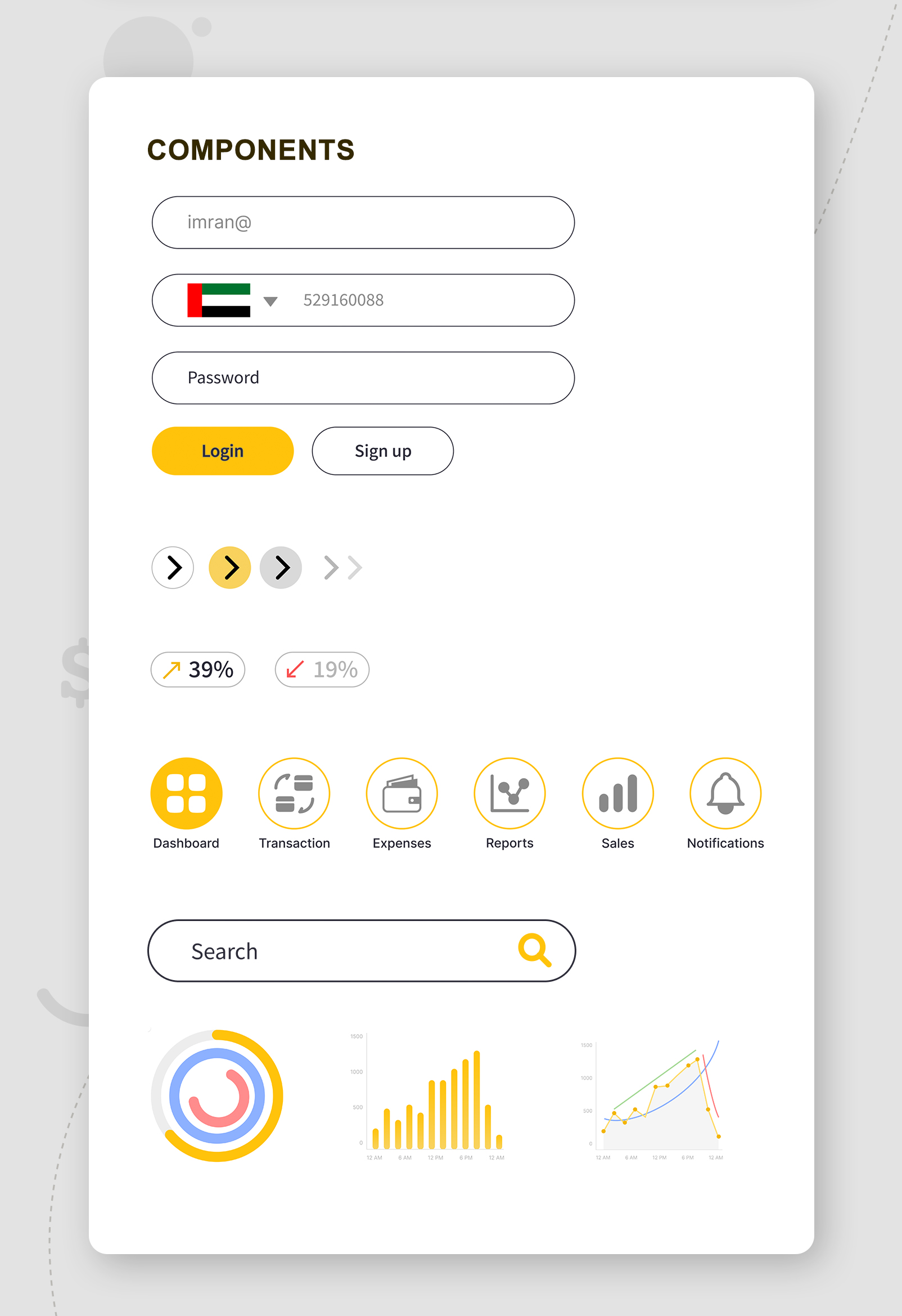
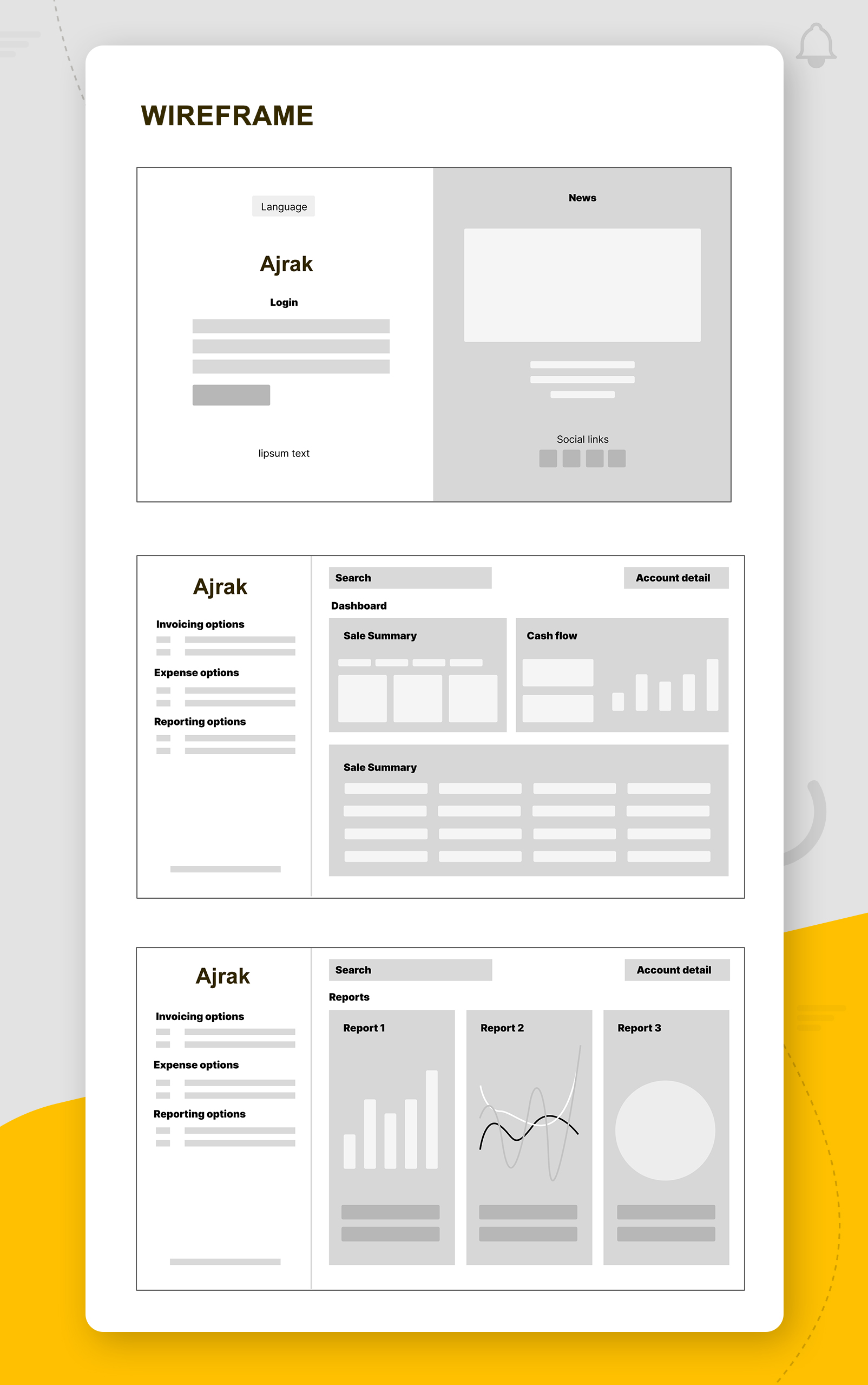
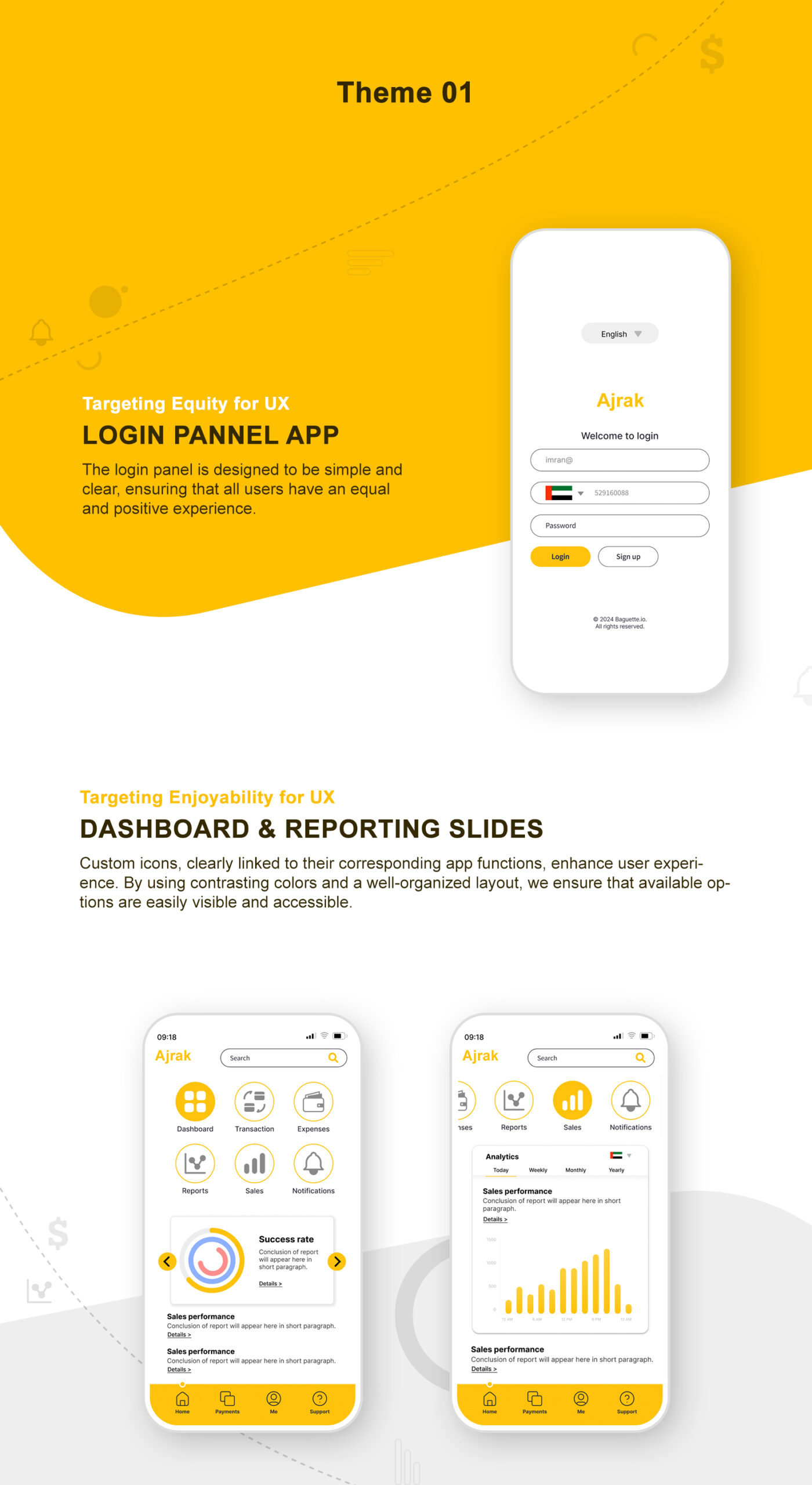
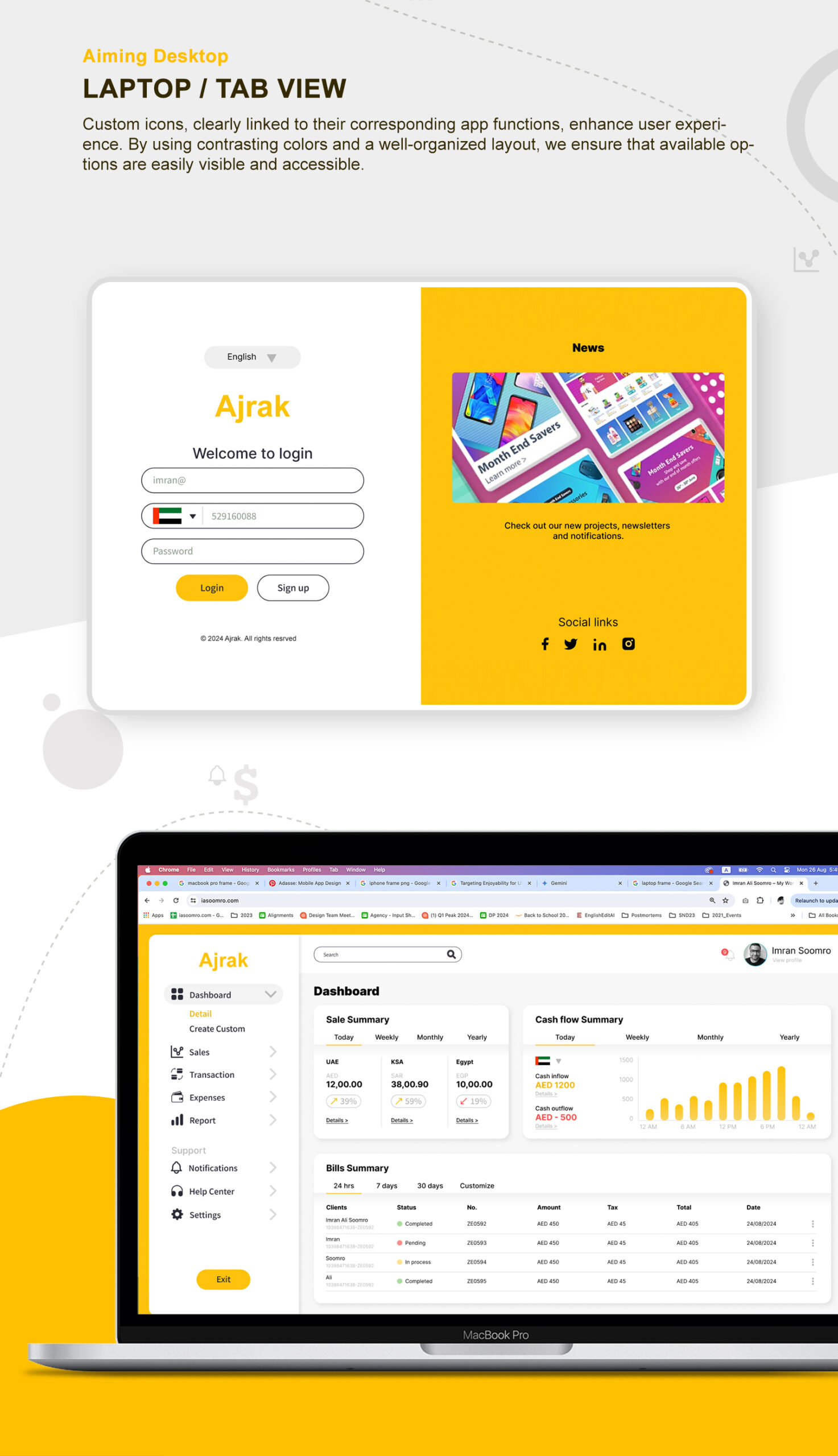
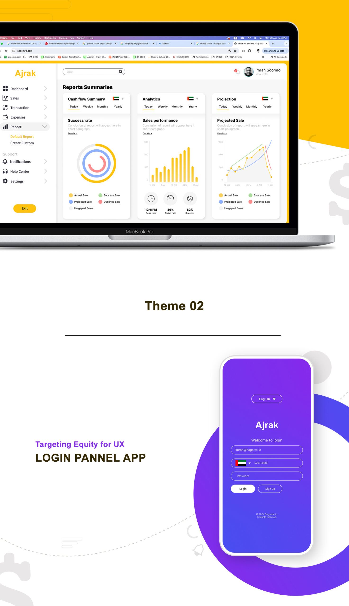
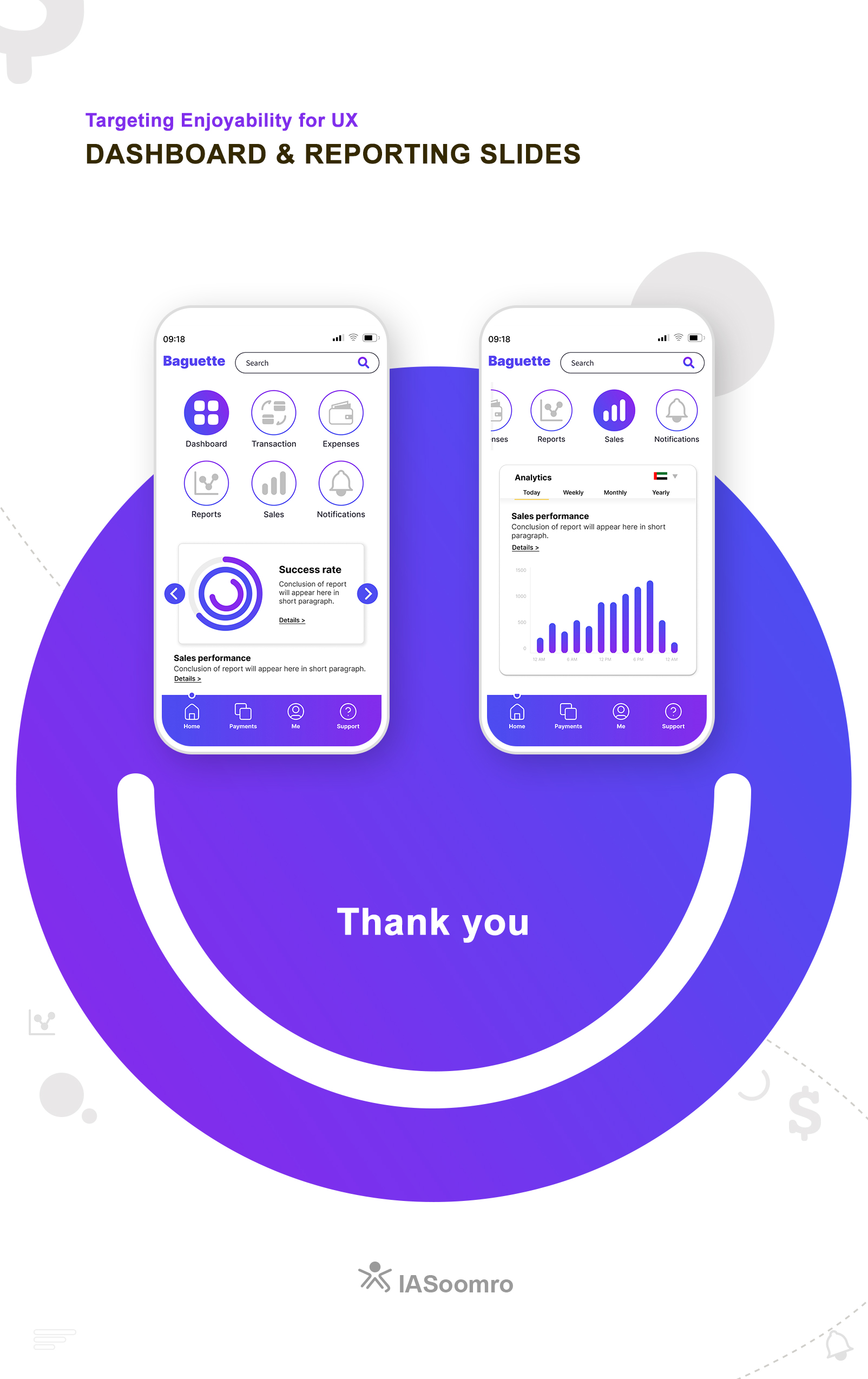
UI Design Project - Financial APP
My role: Production Planning, Coordination, Developing Dashboard, Innovating, Problem solving, Style guide, Templates, Automation & Reporting.
UI/UX Project of Financial APP


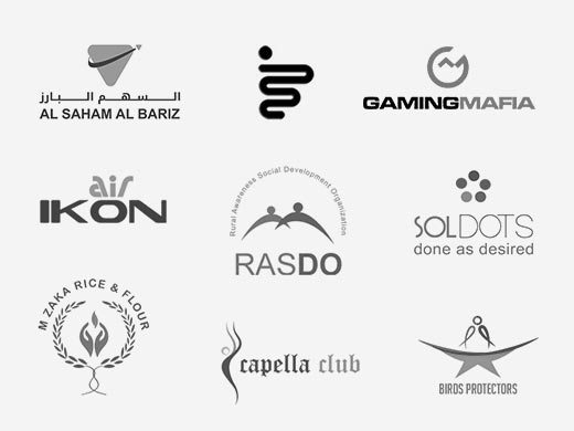
Logos collection
Project: Logo Designing Projects
Company : Individual clients
Scale of project: Small & Medium
My Role: Creating brand identity
Context
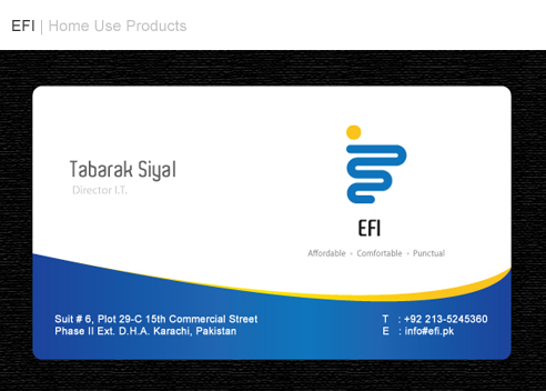
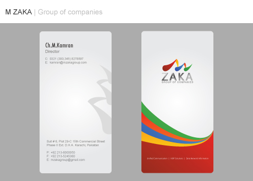
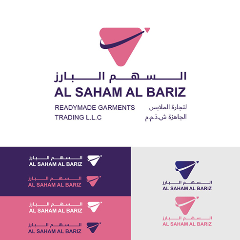
Collection of Logos Designing
My role: Production Planning, Coordination, Developing Dashboard, Innovating, Problem solving, Style guide, Templates, Automation & Reporting.
Logos collection
Project: Logo Designing Projects
Company : Individual clients
Scale of project: Small & Medium
My Role: Creating brand identity
Context


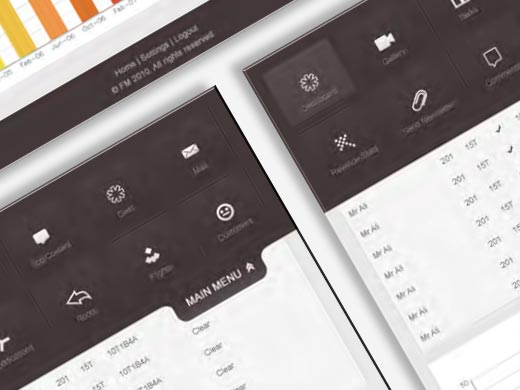
User Interface of a Desktop application
Project: UI/UX project
Company : Web-Innovations
Scale of project: Small
My Role: Understanding Needs, Providing UI Design
Context
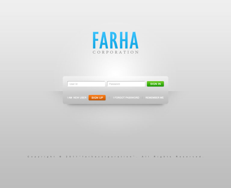
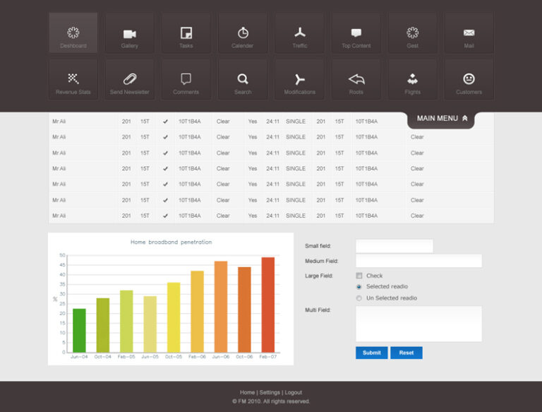
UI was required for CRM system used by internal stakeholders.
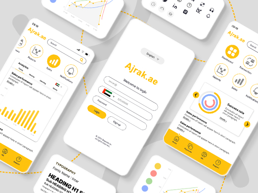
Requirements were to create easy navigated & clean UI including Projects and status section, Reporting section, Sales section, internal communication section etc…
Following a collaborative brainstorming session, I designed a solution that incorporated a set of customized icons reflecting the services offered by the application and a well-organized layout promoting natural navigation.
User Interface (Desktop)
My role: Production Planning, Coordination, Developing Dashboard, Innovating, Problem solving, Style guide, Templates, Automation & Reporting.
User Interface of a Desktop application
Project: UI/UX project
Company : Web-Innovations
Scale of project: Small
My Role: Understanding Needs, Providing UI Design
Context
UI was required for CRM system used by internal stakeholders.
Requirements were to create easy navigated & clean UI including Projects and status section, Reporting section, Sales section, internal communication section etc…
Following a collaborative brainstorming session, I designed a solution that incorporated a set of customized icons reflecting the services offered by the application and a well-organized layout promoting natural navigation.


Branding Project - OORET
Project: Branding Project
Company : Private
Scale of project: Medium
My Role: Understanding requirements, Creating brand identity
Context
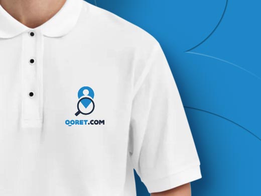
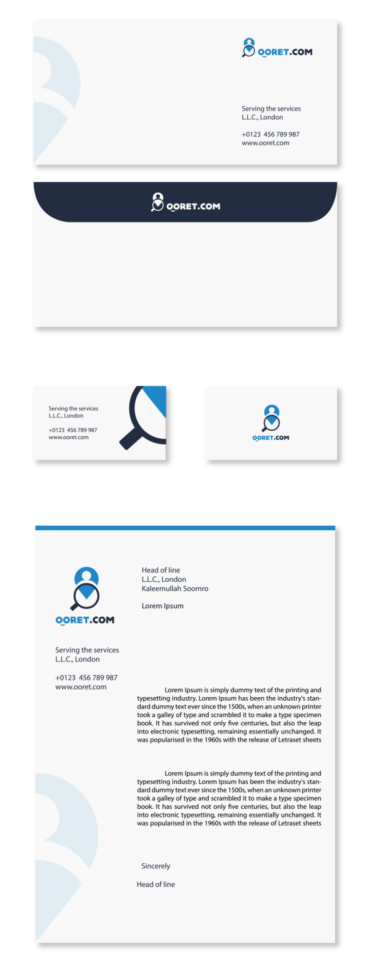
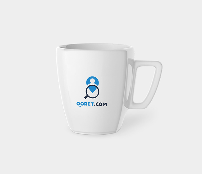
I designed a brand identity for a company that required candidates on hourly basis in the near by location, The plate-form helps the potential employees and employers to connect for job.
I wanted to create a symbol that makes users feel like they can easily find what they’re looking for nearby. So, I came up with an idea that combines a magnifying glass with a location symbol. the client approved the identity in one go as it was simple and unique.
Branding - Concept & execution
My role: Production Planning, Coordination, Developing Dashboard, Innovating, Problem solving, Style guide, Templates, Automation & Reporting.
Branding Project
Project: Branding Project
Company : Private
Scale of project: Medium
My Role: Understanding requirements, Creating brand identity
Context
I designed a brand identity for a company that required candidates on hourly basis in the near by location, The plate-form helps the potential employees and employers to connect for job.
I wanted to create a symbol that makes users feel like they can easily find what they’re looking for nearby. So, I came up with an idea that combines a magnifying glass with a location symbol. the client approved the identity in one go as it was simple and unique.


Email: ias.creator@gmail.com
Call me: +971 50 303 8980
© 2025. Design and Developed by iasoomro.com
